Jump to content
  • Welcome to the eG Forums, a service of the eGullet Society for Culinary Arts & Letters. The Society is a 501(c)3 not-for-profit organization dedicated to the advancement of the culinary arts. These advertising-free forums are provided free of charge through donations from Society members. Anyone may read the forums, but to post you must create a free account.

Edit History

rotuts

rotuts

I took a closer look at mine:


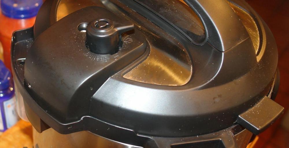
look in the back,  the 'tab' or extrusion where the pressure real ease is has to line up on the L side of the tab or extrusion on the bottom part:


this is the back part turned 45 degrees for the pic :


567c1f947754f_IPBack.thumb.jpg.a125fc661


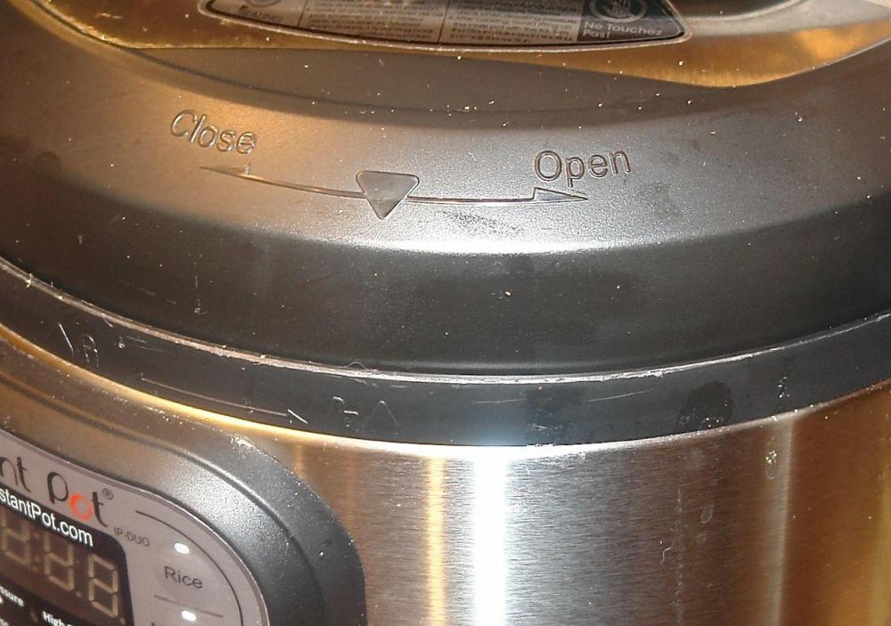
here is the front at the same time :


567c1fac4dc7a_IPFront.thumb.jpg.b6bcb8c5


Ive mentioned in the past that both the top and the bottom 'markers' would be better seen in a contrasting color.


the two arrows and the rest of the info might be more helpfull in white


this pic is with a high powered Flash.   impossible to see in 'reasonable'kitchen light


that's why the back part is easier to see


My pot's surface needs some cleaning it seems


567c203d804d8_surprised.gif.02f780594705

rotuts

rotuts

I took a closer look at mine:


look in the back,  the 'tab' or extrusion where the pressure real ease is has to line up on the L side of the tab or extrusion on the bottom part:


this is the back part turned 45 degrees for the pic :


567c1f947754f_IPBack.thumb.jpg.a125fc661


here is the front at the same time :


567c1fac4dc7a_IPFront.thumb.jpg.b6bcb8c5


Ive mentioned in the past that both the top and the bottom 'markers' would be better seen in a contrasting color.


the two arrows and the rest of the info might be more help fill in white


that's why the back part is easier to see


My pot's surface needs some cleaning it seems


567c203d804d8_surprised.gif.02f780594705

×
×
  • Create New...