David A. Goldfarb
-
Posts
1,307 -
Joined
-
Last visited
Content Type
Profiles
Forums
Store
Help Articles
Everything posted by David A. Goldfarb
-
This is true, but for a chef's knife in particular I think the feel is the first requirement, and if the feel isn't right, then it doesn't matter how it sharpens or how long it holds an edge.
-
I haven't really looked extensively, since I live in New York and can try lots of things in person, and I have plenty of knives, so I don't buy new ones that often, but it probably makes more sense to see who has the knives you're interested in and then take a look at their return policy. One place I've bought knives from is-- http://www.thebestthings.com/misc/return.htm , which has a reasonable return policy.
-
It's very hard to say what will feel right in your hand with your cutting style. If there is a way you can try things out, perhaps buying a few knives with the option of returning the ones you don't like, I'd recommend it. For instance, I have a light weight 12" carbon steel German-style Sabatier that feels great to me, but I had a 10" French-style Sabatier that always felt too light. In 10" chef's knives, the Wusthof extra wide feels better than the Sabatier I had, and I grew up using an 8" Henckels, so that one will always feel good to me. I like the 8" Henckels for tasks where I'll be rocking the knife on the board, using the point as the fulcrum, but I prefer a lighter and sharper 8" French-style carbon steel Sabatier for tasks where my elbow is the fulcrum, and I'm lifting the knife from the board between cuts, as long as the food isn't something that will be discolored by carbon steel.
-
Japanese Cocktail Technique Seminar : May 3-4
David A. Goldfarb replied to a topic in Spirits & Cocktails
Beautiful diagrams, Sam. -
That's great! All that fur to pipe out!
-
Try getting closer. The counter isn't really adding anything to the photo, and extra stuff around the edges of the frame can be a distraction. You could also crop after the fact, but it's better to get it right in the camera when you can. Try shooting at a lower angle or propping the sandwich up to show more of what's inside. This photo's got 90% toasted bread for a 10% sliver of salami, cheese, and something underneath. You could cut it in half on the diagonal and layer one half on top with the cut angled toward the camera to show what's inside. For examples look at your favorite food magazines or here's a pretty well moderated food styling group on flickr-- http://www.flickr.com/groups/foodstylism/pool/ Sandwiches are tricky, because the interesting part is between the bread, but check out these quesadillas-- or this croissant sandwich-- or this burger--
-
Culinary Confession: Where are you shirking?
David A. Goldfarb replied to a topic in Food Traditions & Culture
"Lettuce shame" sounds like something from one of those quintessential New York Post headlines, like the one from a front-page article about a former police chief's drinking problem--"TOP COP'S BOOZE SHAME." -
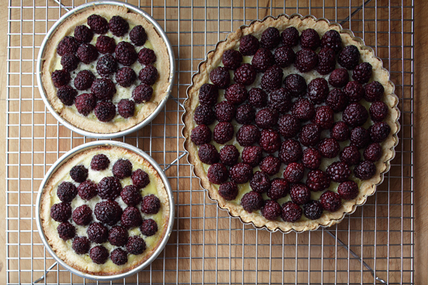
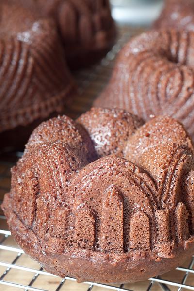
Last week blackberries were something like three pints for $5, so I made blackberry tarts and still haven't finished all the blackberries-- And my three year old son has been asking for bundt cakes, so we made some chocolate mini bundts this morning--

-
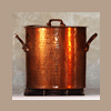
There is a metal fabrication shop in Brooklyn called Hammersmith making copperware in small quanitites as a side business and selling it mainly through a shop called The Brooklyn Kitchen. Their website seems to be under reconstruction at the moment, so they don't have much listed online, but here's one example-- http://www.thebrooklynkitchen.com/web-store/cookware/copper/hammersmith/195-copper-sauce-pan-18cm-wo-lid/ They have more pieces in the store, and prices are comparable to Mauviel professional tin-lined copperware. They currently have some big contract with the City to make some kind of utility boxes or manhole covers or something, but they used to be a major supplier of copperware to restaurants and hotels, so they have molds and forms and tooling on hand for these pieces.
-
You would think, but I'm not so sure. When a pot is on the fire, leaving the lid on causes the steam to recirculate instead of dissipating into the air, and that keeps heat in. When the pot is cooling, there isn't so much steam being generated, at least once it's below boiling. It's probably not a big effect, but it would be interesting to measure, if I could find a convenient way to test it. In any case, if I leave the lid on when cooling, it's usually because I don't want stuff falling into the pot, so the heat retention/cooling effects are secondary concerns. Another attraction of the copper stock pot is it does cool faster than a less conductive pot in an ice bath.
-
Culinary Confession: Where are you shirking?
David A. Goldfarb replied to a topic in Food Traditions & Culture
Lettuce will last a bit longer if you rinse it and roll it up in a damp towel. Cold lettuce soup is an option, though I've never done it. Mark Bittman I think did that recently in one of his Minimalist columns in the NYT. Here it is-- http://www.nytimes.com/2010/04/07/dining/07mini.html -
Put a room-temperature copper lid onto a hot copper pot and the lid gets hot pretty quickly and becomes another surface to radiate heat (into the air, not the ice bath in this case), just like any kind of heat sink attached to something hot.
-
I have a couple of universal lids for pans and pots that don't have their own lids or when I need more lids of a certain size than I have. One is stainless with the handle in the center, kind of like this one, which works fine on stockpots and stew pots, but on long-handled pans, the handle interferes with the lid. The other one is a Cuisinart vented universal lid that I think is discontinued, and the handle is off center and there's a cutout for the pan handle so that it can fit on long-handled pans. There's no particular reason for having copper lids, other than that they match visually and can become part of the presentation, but if you want to cool a pot in an ice bath but leave it covered, the copper lid will draw off some more heat.
-
Culinary Confession: Where are you shirking?
David A. Goldfarb replied to a topic in Food Traditions & Culture
Polishing the copper. I'll do it when we have a dinner party, maybe. -
Copper stock pots do keep a nice even low simmer and react fairly quickly to temperature adjustments depending on how large they are, but I suspect a pot with a thick copper bottom should be similar. They are generally thinner than saute pans, frypans, and rondeaux, because they only need to be thick enough to support their structure. The 9.5" in my avatar is 2mm, and the 11" is more like 2.5-3mm. As they go up in size, I think there is less advantage to a copper stockpot, because the volume is increasing geometrically with respect to the area of the cylinder and its base, and the heat capacity of the contents becomes more important than the properties of the container. This is what the long handled flat lids look like, by the way, if you haven't seen them (these are pretty pricey)-- http://www.frenchcopperstudio.com/longhandles.html The only one I have is a Mauviel, and it looks pretty much like these. There is also a small manufacturer of copperware in Brooklyn that makes this style of lid. The handles are weighted toward the center of the lid so they fit nicely, and they work well with long handled pans and saucepans. For pots with short loop handles, lids that have more conventional handles in the center are more convenient.
-
I think the secret of the low simmer on restaurant ranges is the gas pilot. I discovered this once when cooking in a friend's restaurant kitchen and we'd made some steamed mussels, leaving the pot containing some remaining wine and garlic in the bottom on the stove with the flame off, and about 20 minutes later we smelled something burning. That was the pot sitting on just the pilot.
-
If you want to market a product as "super premium," silver lining is considered a better conductor than tin and it has a higher melting point. Occasionally one sees old European copper pieces lined with silver, and there was I think a Georg Jensen line of copperware that had silver lining. Some of the older hammered Mauviel tin-lined copper is heavier than 2.5mm--as much as 4mm in some cases. Heavier weight pieces today are described as "2.5-3.5mm" accounting for the effect of hammering. Stainless lining is easy to clean and can handle higher temperatures, but tin is slicker and more sensitive to temperature changes. I have mostly tin and a couple of stainless pieces. 2.0mm copper isn't bad for pans when you want to be able to shake and flip ingredients. Ranhofer wrote that such pans should be thinner than other copperware, presumably for the same reason. I have a 2.0mm non-stick frypan that I use mostly for omelets, and it's perfect. I think I'd need to embark on a new exercise routine to be able to toss the contents of my 12" hammered copper saute pan at around 13 lbs. empty. With two hands I can do it a few times before it starts getting tiresome. I like the traditional shapes, but the handle designs vary. The more modern Mauviel handles have a little more distance between the handle and the rim of the pot, so there is space for a wider variety of covers with overhanging lips. Older Mauviel handles tend to come much closer to the rim, because they were designed to work with the long handled weighted covers, which are wonderful (I have a 10" cover in this style) but expensive.
-
Light weight copper is "decorative" in the sense that it is mainly about presentation and doesn't have the cooking advantage of very even heat distribution associated with heavy copper, but that doesn't mean you can't cook in it. Most copperware in the world is light weight (1-1.6mm thickness), so you can certainly cook in it as long as it is lined with tin, stainless steel or less commonly silver or nickel, but you need to be more careful with it than with heavy (2.5-4mm) copper, since it won't distribute the heat as evenly. I grew up using lightweight copper cookware from Chile, for instance, and we cooked in it all the time, and some of those pieces I still use regularly for tasks like boiling water, heating soups, or making a gratin in the oven, that don't require such attention as frying or sautéeing.
-
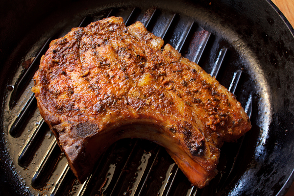
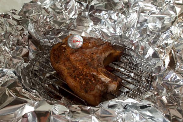
Smoking a big heritage pork chop from The Meat Hook in Williamsburg, Brooklyn, NYC apartment style in the wok tonight-- and finishing things off in a cast iron grill pan under the broiler--

-
Brooklyn Kitchen in their new location at 100 Frost St. in Williamsburg now carries Fee Bros. bitters.
-
Definitely an improvement. If you want an inexpensive image editing program, Photoshop Elements will give you a lot of the more important Photoshop features for basic editing without the cost of the full program. Paint Shop Pro is also not too bad. If you've got an iPhone or iPod touch and are only handling small images for posting on the web (i.e., no larger than the images produced by the iPhone camera), look for an app called "Photogene," which handles the basic image editing tasks, as long as you know how to upload images to your iPhone/iTouch. Then you can upload them to flickr and link them to eGullet posts.
-
Direct flash tends to look harsh. As a general rule, the larger the light source relative to the subject, the softer the light. If you can get the flash off the camera and move it closer to the subject, bounce it off a larger surface like a white card or the ceiling or a wall, or diffuse it with something like a softbox, that will make it softer. The on-camera flash is a fairly small hard light, so it's hard to make it look good, but when the camera knows the flash is on, it sets the white balance close to the color temperature of the flash, so the color should be accurate. Flash is about the same color temperature as daylight on a bright clear day. In your mushroom photo, the daylight from the window is indirect light, so it's a little blue. If you have some kind of image editing software you can probably adjust that. For instance, if you have a "shade" setting for the white balance, you could use that, and it should warm up a bit. If you've only got the built in flash, and there's no way to swivel it, try putting a small piece of paper or crumpled plastic or white cloth or bubble wrap over it and that will make it a bit softer. If there is a sensor that detects the flash exposure, be sure not to cover the sensor, and it should be able to compensate for whatever diffuser you might put over the flash.
-
The main thing this photo has going for it is the light, and that's the key thing--much more important than what camera you are using. A DSLR will give you access to better lenses and more control and higher resolution, but if you are only posting your images on the web, you don't really need very high resolution. A tripod will enable you to take advantage of available lighting when it presents itself to you. For now, stick to one light source, preferably from a window, and turn off any other lights in the room, since they may cast unwanted shadows and will not be the same color as the main light. For lighting to look natural, it should appear that you have one "main" light, and any other lighting is "fill" which adjusts contrast, or an accent light to add sparkle or highlight some particular element of the image. The more lighting you use, the more it starts to look theatrical as opposed to natural, which isn't necessarily a bad thing, but it's a more difficult aesthetic to master. I have professional lighting equipment, which I might use to construct a shot like this, which tends toward the theatrical-- But most food shots I do with window light and maybe a reflector or two, because I like the natural look. A reflector can be as simple as a sheet of paper or a piece of white foamboard. Sometimes I just take a sheet of white paper, fold it at 1/3 its length into an "L" shape, and use a bottle or something to weight it down so that it stands up, and move it until the image in the viewfinder or on the LCD screen looks right. Don't be afraid to move the reflector as close as possible to the subject as long as it is just outside of the picture. This one is just soft window light with all the room lights turned off and a sheet of paper to throw a little more light into the shadows on the right side.-- This one is hard window light when the sun was at a relatively low angle, like in jmahl's shot-- I used a book or whatever was handy to block the light so the sun would fall in a narrow beam and the background would be dark and make the gazpacho foam stand out, and I used a white reflector on the right side to get more shadow detail and to remove some distracting reflections from the glass.
-
Japanese Cocktail Technique Seminar : May 3-4
David A. Goldfarb replied to a topic in Spirits & Cocktails
I've seen this technique with an orange peel in the "Del Sasser" at Angel's Share, and it seemed as if its purpose was as much to release an aroma at the table in the vicinity of the cocktail as to flavor it directly. I don't recall the entire contents of the drink (which I highly recommend), but the main flavors were house-smoked bacon-washed bourbon, pomegranate juice, honey, and Angostura. Another description on the net also mentions plum liqueur and fresh lime juice, which I could believe. I have to go back and order another one. -
There are things you can do in image editing software to increase color saturation, but if you have manual control of your camera, try bracketing the exposure in small increments, like 1/3 stop or 1/2 stop, whichever your camera can do. Try making two exposures above what the meter says is "right" and two exposures below, and then look at them on your computer monitor--don't judge by the LCD on the camera. In this regard, digital is just like color slide film--there is a narrow range of "correct" exposures, depending on what you want to emphasize, and you need to experiment a bit to get it just right.