Jump to content
  • Welcome to the eG Forums, a service of the eGullet Society for Culinary Arts & Letters. The Society is a 501(c)3 not-for-profit organization dedicated to the advancement of the culinary arts. These advertising-free forums are provided free of charge through donations from Society members. Anyone may read the forums, but to post you must create a free account.

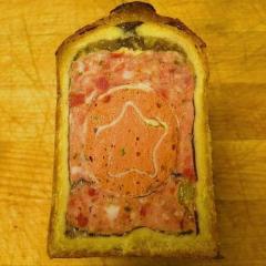
Artwork in Gourmet, Not looking good enough to eat


Mimi Sheraton

Recommended Posts

Yes, Toliver, it was.

In the new August issue which arrived well before the beginning of the month this time (credit is due), the only artistic decision that really made reading difficult for me was the use of spindly, small white font in a compressed format against black for the first page of Ruhlman's revisionist take on the hot dog.

Do photographers have a term like "chiaroscuro" that describes, instead, a sharp contrast between deep and blurred focus? Currently, the love of soft focus to play up the one or two areas in the image that are in focus borders on overkill.

It's only a bit annoying to me when it's not a matter of obscuring the background for the sake of emphasizing the foreground, a traditional device. For example, cf. the image of a beautiful young woman eating a pork chop. (How refreshing that it is not a dainty crustless sandwich!) I'm sure it's the unexpectedness of the aesthetic that the photographer enjoys. Just like artists who don't do commercial work, these folk have to experiment, alter their style and need room to feel creative or distinctive. The disconcerting loss of sharp edges and use of light evokes Vermeer and other Netherlandish art of the seventeenth century.

On the other hand, I notice there is a trend shared with some of the best photography here at eGullet or on Chocolate & Zucchini: the cropped (as in Degas's paintings AND photographs) close-up.

Some of the montages suggest the internet, though I am not sure the latter is a direct influence. Cf. page 105. Very Flash grid.

Favorite picture in issue: wizened glistening peas and rabe in Quick Kitchen.

Someone needs to fire the company that Spain uses to promote tourism. Old campaign, always odd and unappealing.

"Viciousness in the kitchen.

The potatoes hiss." --Sylvia Plath

Link to comment
Share on other sites

On the other hand, I notice there is a trend shared with some of the best photography here at eGullet or on Chocolate & Zucchini:  the cropped (as in Degas's paintings AND photographs) close-up.

As someone who is VERY guilty of the close-up crop, I will say that for an amateur with rather unappealing (when photographed, though certainly not when lived-in), poorly-lit interior settings, the close-up is the only way to make the food attractive without using my flash, which just washes everything out. Professionals, however, are not subject to that limitation...

Favorite picture in issue:  wizened glistening peas and rabe in Quick Kitchen.

Someone needs to fire the company that Spain uses to promote tourism.  Old campaign, always odd and unappealing.

I loved that photo, too, and the recipe looks quite delicious. And thought the exact same thing about the Spain ad - so weird. I did not understand what it wanted to tell me.

Edited by Megan Blocker (log)

"We had dry martinis; great wing-shaped glasses of perfumed fire, tangy as the early morning air." - Elaine Dundy, The Dud Avocado

Queenie Takes Manhattan

eG Foodblogs: 2006 - 2007

Link to comment
Share on other sites

Yes, Toliver, it was.

Hmmm...usually there's a change in the discussion title to indicate there was a merge.

Do photographers have a term like "chiaroscuro" that describes, instead, a sharp contrast between deep and blurred focus?  Currently, the love of soft focus to play up the one or two areas in the image that are in focus borders on overkill. 

I don't know if there's an actual name for it but such photos illustrate what is called "depth of field [of focus]" where one part of the picture is in focus and another part is out of focus.

Ansel Adams was extremely good at the complete opposite style where everything is in focus, from the moon in the sky to the grass in the foreground. It's not easily achieved and he was a master at it.


“Peter: Oh my god, Brian, there's a message in my Alphabits. It says, 'Oooooo.'

Brian: Peter, those are Cheerios.”

– From Fox TV’s “Family Guy”


Tim Oliver

Link to comment
Share on other sites

I'm really late to this party -- coffee and port time. I haven't read every post, the way I missed the really good dinner chatter, and I'm just going to comment on the "depressing" covers.

I love them-- uncluttered and focussed. They catch the eye, which is what they' re meant to do.

(And I stick to my ooinion that Martha Stewart Living has the best photography, food or otherwise, of any mainstream mag.)

Margaret McArthur

"Take it easy, but take it."

Studs Terkel

1912-2008

A sensational tennis blog from freakyfrites

margaretmcarthur.com

Link to comment
Share on other sites

Do photographers have a term like "chiaroscuro" that describes, instead, a sharp contrast between deep and blurred focus?  Currently, the love of soft focus to play up the one or two areas in the image that are in focus borders on overkill. 

I don't know if there's an actual name for it but such photos illustrate what is called "depth of field [of focus]" where one part of the picture is in focus and another part is out of focus.

Ansel Adams was extremely good at the complete opposite style where everything is in focus, from the moon in the sky to the grass in the foreground. It's not easily achieved and he was a master at it.

Yes, this approach is generally referred to as a "shallow depth of field". Chiaroscuro refers more to contrast between light and dark; Caravaggio's paintings are a good example.

In the new August issue which arrived well before the beginning of the month this time (credit is due), the only artistic decision that really made reading difficult for me was the use of spindly, small white font in a compressed format against black for the first page of Ruhlman's revisionist tak

e on the hot dog.

I agree, I absolutely hate when text is reversed out of a dark background in white or any light colour. It is often used to break up the page, or highlight a particular section, but it is so much more difficult to read. David Ogilvy, a legend in the advertising world was totally against it for this reason.

Edited by Corinna Dunne (log)
Link to comment
Share on other sites

I think my question might have been phrased differently:

While "chiaroscuro" refers to the effect achieved when an artist accentuates a strong contrast between light and dark, _________________ refers to the aesthetic a photographer uses when playing a precise, deep focus against a surrounding soft focus and drawing our attention to the sharp contrast.

It just seems that some of this thread's sprinkling of complaints about images seeming out of focus stems from the fact that major portions of compositions are occupied by virtually amorphous blur with only a small portion of the illustration in focus. Leafing through the August issue, I see that precise definition and sharp focus are not always used so contrasts can be more subtle than I first thought.

On the cover, for example, you've got a clear (more or less?) focus on scattered crumbs of the tart Ruth Reichl singles out in the Letter from the Editor in the foreground. They cast shadows and against the metal surface, sit above their own reflections. You see the weave of the tablecloth. Given the low angle of the shot, the tart climbs up the flat surface of the page with few visual markers of spatial depth since the fabric's weave disappears into a slightly pink then white haze on the right. Sort of like the tables in a still-life by Cezanne where edges disappear and surfaces tilt instead of recede, except here in a close-up, the top/rear portion of tart is blurred, too, due to shallow depth of field. Since the tart occupies little more than a third of the cover's space, there's little that is in focus, not even the lower edge of the cover, especially on the right.

Woman with the pork chop? Just her face and a bit of the salt-crusted chop are in focus; the rest is a blur. The effect is interesting, and often makes the food desirable (the raspberries on the cover make me want to add them to my shopping list), but when almost all the in-house photographs are shot this way, the style no longer seems as distinctive.

Now, I can't believe I wrote all this. I need a beer.

"Viciousness in the kitchen.

The potatoes hiss." --Sylvia Plath

Link to comment
Share on other sites

  • 4 weeks later...

Any feedback on the September issue?

The decision to celebrate a 65th anniversary by using covers to divide the issue into sections almost seems like a response to this thread's complaints about recent covers. In featuring the drawings of one particular artist, moving through the decades he designed covers, Gourmet teaches an interesting lesson about the relationship between period style and personal taste. I am going to withhold my own opinion to see if any of you have comments.

* * *

Further observations:

1) Clever image-based Table of Contents. Looks very Flickr meets Sol Le Witt.

2) Eerie. Someone on staff seems to be paid to read threads here, or overlaps are due to the power of food trends. The panna cotta with fruit gelee, for example, evokes recent posts of Patrick S. in the Dessert thread. Also the announcement for the upcoming PBS series "Diary of a Foodie" marries the food blog to our discussion of the new word.

3) Lovely photographs of a farm or wine-country location, though it's the food and the setting that prove most effective. Artistic, crisply focussed shot taken from above a spread of food offset by a striking visual accent--a spotted feather. Demographics odd since it's supposed to be about generations coming together at harvest time. Who knows who gave birth to those blond children given ages of the deliberately multicultural fashion model types in the spread with the one picturesque wizened old man. Middle-aged folk not photogenic?

4) Open up the magazine. The two pages before you are called the verso (page to your left, the reVerse of the sheet of glossy paper) and recto (right-hand page). It's rare to find content by staff or contributing photographers and writers on both verso and the recto before you. What can you expect when subscriptions are so inexpensive or complimentary? Sophisticated marketing division. Careful when you go through and pull out all the heavy pages, rip out the fold-overs, etc. The layout takes pains to put an ad on recto and the beginning of a new article on the verso of the same sheet of paper; there are only a few sections devoted exclusively to ads. Gourmet staff or culinary professionals populate the ads, the obverse of product placement. One of the thick matte cards is content by Lesley Porcelli.

5) Overall, the photographs are highly effective in making the reader want to follow some of the recipes, or at the very least, buy some of the featured produce. Cover marks seasonal transition subtly: CORN, mushrooms, apples and grapes.

Edited by Pontormo (log)

"Viciousness in the kitchen.

The potatoes hiss." --Sylvia Plath

Link to comment
Share on other sites

Demographics odd since it's supposed to be about generations coming together at harvest time.  Who knows who gave birth to those blond children given ages of the deliberately multicultural fashion model types in the spread with the one picturesque wizened old man. Middle-aged folk not photogenic?

I refuse to believe that those hip models would ever hang out with the old man. :laugh:

There are some nice photos in this issue, but the clutter of ads kills any visual impact. You can't blame the magazine, though, for wanting to make money.

Todd A. Price aka "TAPrice"

Homepage and writings; A Frolic of My Own (personal blog)

Link to comment
Share on other sites

  • 7 months later...

Just got the March issue (why so late?) which made me think of this thread. The cover is so ungodly booorring. I'd have to look inside to see exactly which recipe this is (and I'm not even motivated enough to do that), but it looks like a lump of bland diner hash browns.

Link to comment
Share on other sites

the march cover looks like a throwback to the artwork in the big ol' Gourmet cookbooks published back in the 60s - 70s. is that a good thing? me, i'm sick of retro. also: in the editorial spread that went with the southern easter menu, i was astonished to see the models sprawled out over the tables, elbows everywhere, slouching over their slices of ham. oy. what Southern granny (she's in the pix, too - seen from the back) would put up with that?

I agree. Retro is fine for many things, but not so much in food photography. A magazine cover should make you drool in anticipation and motivate you to MAKE THAT RECIPE RIGHT NOW!

It's disappointing to see one of the country's most respected food publications putting out photography that's less inspiring than some of the home photos posted by egulleters every day!

Link to comment
Share on other sites

  • 1 month later...

Isn't it interesting when something just shouts NO? The website pictures have been absolutely ghastly for at least 6 months, maybe more. I don't insist on cookbooks with fabulous pictures and have many with none, but I do think magazines absolutely need them and Gourmet in particular, given its provenance and profile.

Rover

Link to comment
Share on other sites

  • 1 month later...

I just got the July issue of Gourmet.

I have to say I was really impressed with the photography this time.

A little arty, perhaps.

The pictures in the article on frozen desserts, though, just blew me away.

Cool stuff.

---

Erik Ellestad

If the ocean was whiskey and I was a duck...

Bernal Heights, SF, CA

Link to comment
Share on other sites

×
×
  • Create New...